Why are all modern stop signs designed with a unique eight-sided shape instead of a standard circle
Ever wonder why the most critical sign on the road sports a unique eight-sided shape instead of a simple circle? The answer lies in a brilliant bit of early 20th-century engineering designed to save lives even when the sign is completely obscured by snow, mud, or darkness.

Too Long; Didn't Read
Stop signs use a unique eight-sided shape so drivers can recognize them from both the front and back, even in poor weather or if the sign is obscured. This design originated in the 1920s as part of a system where a shape’s number of sides indicated the level of danger, with the octagon representing a high-risk requirement to stop.
Behind the Eight Sides: Why Are All Modern Stop Signs Designed with a Unique Eight-Sided Shape Instead of a Standard Circle?
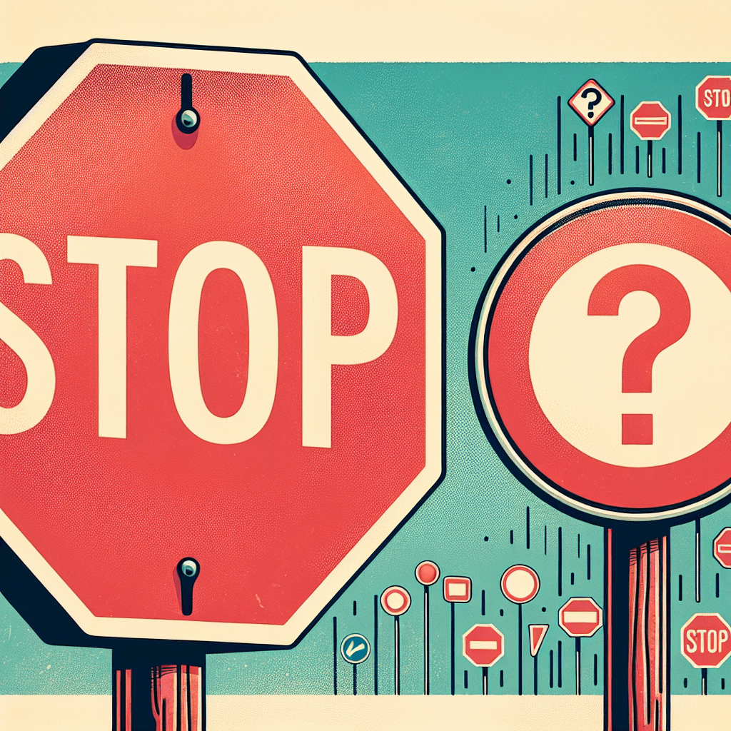
Have you ever wondered why, in a world of rectangular street signs and circular speed limits, the stop sign stands alone as a perfect octagon? It is the only traffic sign in the United States—and much of the world—with eight sides. This design was not a random aesthetic choice made by a bored civil engineer; rather, it was the result of a deliberate effort to solve a life-or-death problem on the early 20th-century roads. Understanding why stop signs are designed with a unique eight-sided shape instead of a standard circle reveals a fascinating intersection of psychology, safety engineering, and historical necessity. This post explores the strategic logic behind the octagon and how its shape serves as a silent language for drivers everywhere.
The Chaos of Early Traffic Management
In the early 1900s, the American roadway was a lawless frontier. As automobiles became more common, the lack of standardized signage led to frequent accidents. The first stop sign, appearing in Detroit in 1915, looked nothing like the one we recognize today; it was a simple two-foot by two-foot square of white metal with black lettering.
As more municipalities began installing their own signs, a confusing patchwork emerged. Some used squares, others used circles, and colors ranged from white to yellow. According to the Federal Highway Administration, the lack of uniformity meant that a driver traveling between towns might not recognize a "Stop" command until it was too late. This inconsistency necessitated a national standard that could be recognized instantly by any driver, regardless of their location.
The Geometry of Danger: The Mississippi Valley Standard
The turning point for the octagon occurred in 1923. The Mississippi Valley Association of State Highway Departments met to develop a system where a sign’s shape would communicate the level of danger ahead. They devised a clever "sides-to-hazard" ratio:
- The Circle (Infinite sides): Reserved for the highest level of danger, specifically railroad crossings.
- The Octagon (8 sides): Designated for the second-highest level of danger, requiring a full stop.
- The Diamond (4 sides): Used for "caution" or warning signs, such as curves or pedestrian crossings.
- The Square/Rectangle: Used for informational or regulatory signs (like speed limits), representing the lowest hazard level.
By choosing an octagon for stop signs, engineers ensured that the shape itself conveyed a sense of urgency. The more sides a sign had, the more a driver needed to pay attention.
Visibility and the "Silhouette" Principle
One of the most critical reasons for the eight-sided design is visibility from multiple angles. Traffic engineers needed a sign that was identifiable even if the face of the sign was obscured. This led to the "silhouette" principle.
Recognition from the Rear
Because the octagon is a unique shape, a driver approaching from the opposite direction can look at the back of the sign and immediately know that the cross-traffic has a stop sign. This information is vital for making split-second decisions at intersections. A circular sign would be harder to distinguish from the back, as it might be confused with other rounded informational signs or even tree shadows.
Night Driving and Weather
In the early 20th century, signs were not equipped with the high-tech reflective coatings we use today. Drivers relied on their dim headlamps to catch the shape of a sign in the dark. An octagon stands out against the natural environment—where few objects are perfectly octagonal—making it easier to spot during a storm or at night. According to early research by the National Conference on Street and Highway Safety, the distinct silhouette provided a "redundant" safety feature: even if you couldn't read the word "STOP," the shape told you what to do.
The Evolution of Color
Interestingly, while the shape was standardized early on, the color was not always red. For decades, stop signs were actually yellow with black letters. This was because, in the 1920s and 30s, paint manufacturers could not produce a red pigment that wouldn't fade or peel quickly in the sun. It wasn't until 1954, following advancements in durable porcelain enamel and reflective materials, that the Manual on Uniform Traffic Control Devices (MUTCD) officially mandated the iconic red and white color scheme we see today.
Conclusion
The unique eight-sided shape of the stop sign is a masterclass in functional design. By moving away from a standard circle, early traffic pioneers created a system where geometry communicates as much as language. The octagon was chosen specifically to represent a high level of hazard, to be recognizable from behind, and to remain visible under poor driving conditions.
Today, this shape is so deeply ingrained in our collective consciousness that we react to it almost subconsciously. The next time you press your brake pedal at a four-way stop, remember that the eight sides beneath that red paint are the result of a century of safety engineering designed to keep you safe. Recognizing these small but vital details in our infrastructure helps us appreciate the complex systems that manage our daily lives.