Why is the universal power symbol a line partially inside a circle
That familiar power symbol on your devices isn't a random design; it's the ingenious fusion of the two numbers that run our entire digital world.

Too Long; Didn't Read
The power symbol combines the binary digits 1 for ON, represented by the line, and 0 for OFF, represented by the circle. Engineers overlaid them to create a single symbol for a power toggle or standby state.
Blog Post Title: The Code Behind the Click: Why is the universal power symbol a line partially inside a circle?
You press it every single day. It’s on your coffee maker, your laptop, your television remote, and countless other devices that shape your daily routine. The universal power symbol—a simple vertical line partially intersecting a circle—is one of the most recognized icons in the world, yet few of us ever stop to consider its origin. This symbol is not an arbitrary design; it’s a brilliant piece of visual communication with roots deep in the foundational language of computing. This post will decode this ubiquitous icon, revealing the elegant logic behind its simple design and tracing its journey from engineering shorthand to a global standard.
From Binary to Buttons: The Digital Roots
To understand the power symbol, we first need to travel back to the early days of computing. At its most fundamental level, electronic machinery operates on a binary system. This is a simple language of two states: on and off. Engineers and programmers represented these states with numbers:
- 1 meant "on" or "power connected."
- 0 meant "off" or "power disconnected."
These digits were often printed directly onto toggle switches and controls to indicate their function. A user would physically move a switch to the "1" position to turn a device on and to the "0" position to turn it off. This was clear and effective for a technical audience, but as technology became more consumer-friendly, a more intuitive and universal system was needed—one that could be understood by anyone, regardless of language.
The Birth of a Symbol: Merging 1 and 0
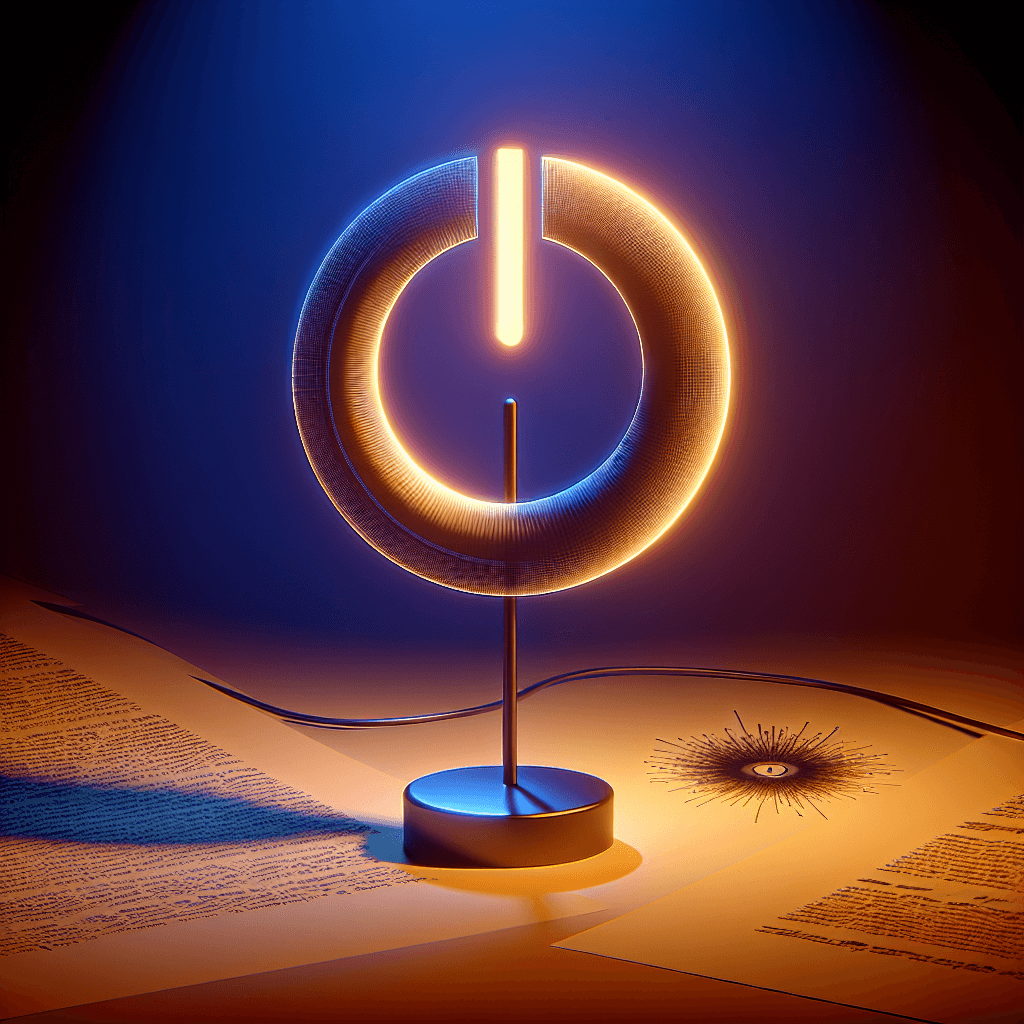
The breakthrough came from a simple, elegant idea: what if you could combine the "1" and "0" into a single icon? The design we know today is a literal superposition of these two numbers. The vertical line (|) is taken from the number 1, and the circle (O) is taken from the number 0.
By merging them, with the line breaking the circle, designers created a single symbol that cleverly communicates both states simultaneously. It represents a button that can toggle a device between its "on" and "off" states. This combined icon elegantly solved the problem of creating a language-neutral symbol for a device's power control. It was a visual representation of the underlying binary logic that made the device function.
Going Global: Standardization and Variations
As this symbol grew in popularity, the International Electrotechnical Commission (IEC) officially standardized it in its IEC 60417 standard for graphical symbols. However, the IEC also defined a subtle but important distinction that often goes unnoticed. Technically, the symbol we see most often—the line inside a broken circle ⏻—represents a "standby" or "sleep" mode. It signifies a state where the device isn't fully powered off but is in a low-power state, ready to be turned on quickly.
The IEC standard defines a few key variations:
- On: A solid vertical line (
|) indicating a device is fully powered on. - Off: A complete circle (
O) indicating a device is fully disconnected from its power source. - Standby/Toggle: The combined symbol (
⏻) for a single button that toggles the power state or puts the device into a low-power mode.
Over time, the standby symbol has become the de facto icon for the main power button on most consumer electronics, as very few modern devices completely disconnect from power with a single button press.
So, the next time you power up your computer or start your favorite streaming service, take a moment to appreciate the small symbol under your finger. It's more than just a button; it's a testament to brilliant design, representing the fusion of the binary "1" and "0" that powers our digital world. This elegant icon is a universal translator, communicating a complex function in a simple, clear graphic that has transcended borders and languages. It's a quiet reminder of the logical foundation upon which our modern, interconnected lives are built.