Why was the first official stop sign actually yellow instead of red until the year 1954
Ever wonder why the world’s most famous red sign actually spent decades dressed in bright yellow? Discover the surprising engineering secret that kept stop signs from turning their iconic crimson color until 1954.

Too Long; Didn't Read
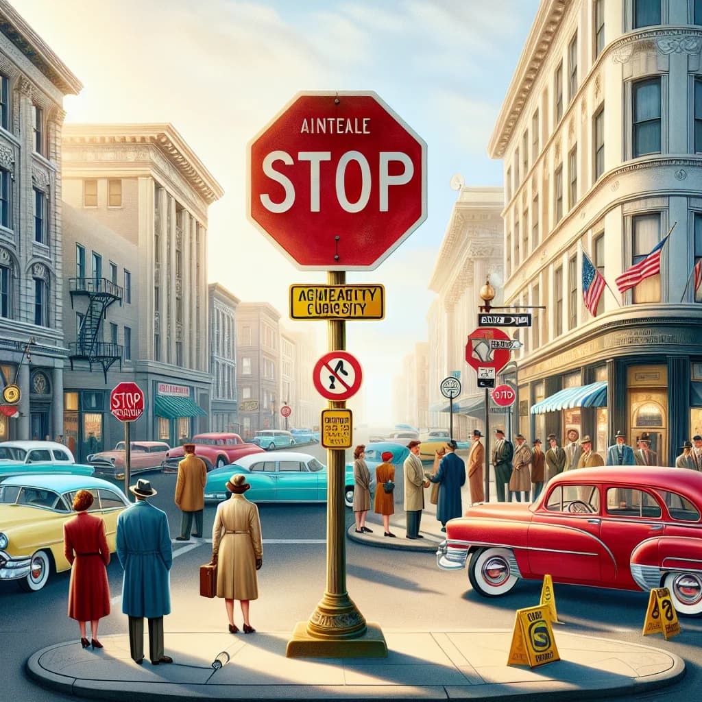
The first stop signs were yellow because early 20th-century red paint faded quickly in the sun and was difficult to see at night. It was not until 1954 that advancements in durable, fade-resistant pigments and reflective coatings allowed officials to switch to the high-visibility red and white design used today.
The Golden Age of Traffic: Why Was the First Official Stop Sign Actually Yellow Instead of Red Until the Year 1954?
Imagine approaching a busy intersection and, instead of the familiar crimson octagon, you are greeted by a vibrant, sunny yellow sign commanding you to stop. For modern drivers, this sounds like a glitch in the Matrix, but for the first half of the 20th century, it was the standard reality of the American road. While we instinctively associate the color red with "danger" and "stop" today, the history of traffic management reveals a fascinating period of trial, error, and chemical limitations. But why was the first official stop sign actually yellow instead of red until the year 1954? The answer lies at the intersection of early 20th-century physics, chemistry, and a desperate need for nocturnal visibility.
The Birth of the Octagon
Before we can understand the color, we must understand the shape. In the early 1900s, chaos reigned on American roads as automobiles began to outnumber horse-drawn carriages. The first stop sign appeared in Detroit in 1915, but it was a simple white square with black lettering—hardly the standardized icon we know today.
By 1922, the Mississippi Valley Association of State Highway Departments met to develop a system of shapes to help illiterate or non-English speaking drivers navigate. According to historical records from the Federal Highway Administration, the association decided that the more sides a sign had, the more danger it represented.
- The Circle: Used for railroad crossings (the highest danger).
- The Octagon: Used for stop signs (second highest danger).
- The Diamond: Used for caution or curves.
- The Square/Rectangle: Used for informational signs.
The Chemistry of Color: The Red Paint Problem
If red was already the universal symbol for danger—used by railroads and maritime signals—why didn’t the first official standardized stop sign in 1924 adopt it? The primary reason was a significant technological hurdle: paint durability.
In the early 20th century, paint manufacturers struggled to produce a red pigment that could withstand the elements. According to the American Association of State Highway and Transportation Officials (AASHTO), red dyes of that era were notorious for fading rapidly when exposed to direct sunlight. Within a year or two, a bright red sign would bleach into a pale, sickly pink or a dull orange. This created a massive safety hazard, as the sign would lose its visual authority and become difficult to read against the horizon.
Why Yellow Was the Superior Choice
Because reliable red paint didn't exist, traffic engineers turned to "Highway Yellow." This color was chosen for several practical reasons:
- Durability: Yellow pigments, often derived from lead chromate at the time, were far more resistant to UV degradation than red pigments.
- Visibility: Yellow provided the highest contrast against the black lettering used for the word "STOP," making the sign legible from a significant distance.
- Nighttime Recognition: Before the invention of modern retro-reflective sheeting, yellow was much easier to see in the dim glow of early incandescent headlights compared to a dark red.
By 1924, the National Conference on Street and Highway Safety officially designated yellow as the standard background color for stop signs, a rule that would remain in place for thirty years.
1954: The Red Revolution
The shift back to red didn't happen because of a change in taste, but because of a breakthrough in material science. By the early 1950s, companies like 3M had developed new reflective materials and durable synthetic resins. Specifically, the advent of "porcelain enamel" and new transparent red coatings allowed signs to stay bright red for years without fading.
In 1954, the Manual on Uniform Traffic Control Devices (MUTCD) was officially revised. This update mandated that all stop signs be red with white lettering. The change achieved two things: it aligned stop signs with the red light of traffic signals and ensured that the "danger" color was finally permanent and highly visible at night through reflective technology.
Conclusion
The story of why the first official stop sign was yellow instead of red until 1954 is a testament to how safety standards are often dictated by the technology of the time. While red was always the desired color for halting traffic, it took decades of chemical innovation to make that vision a functional reality.
Understanding this history reminds us that even the most mundane objects in our daily lives—like a roadside sign—are the results of rigorous engineering and constant evolution. The next time you press your brake pedal at a red octagon, you’re witnessing the conclusion of a 100-year journey from white wood to yellow metal, and finally, to the high-tech red reflectivity we rely on today. For those interested in the evolution of infrastructure, this transition remains one of the most colorful chapters in the history of the open road.