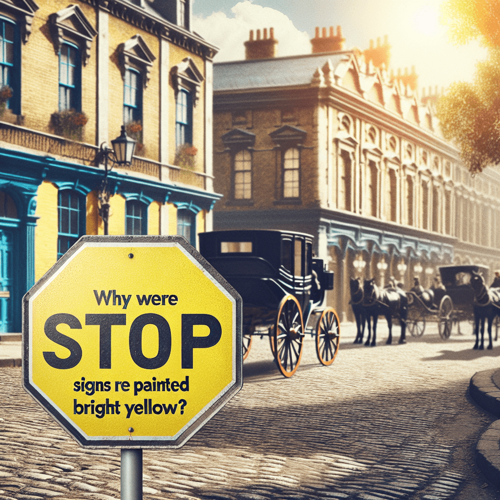
Why were stop signs once painted bright yellow instead of the red we see today
Before the iconic red octagon became a global standard, stop signs actually ruled the road in a startling shade of bright yellow. Discover the hidden history of traffic safety and the surprising reason why red was once considered a "failed" color for the streets.

Too Long; Didn't Read
Stop signs were originally yellow because early 20th-century red paint faded too quickly and was difficult to see at night. In 1954, advancements in durable, reflective coatings finally allowed officials to switch to the universally recognized color for danger: red.
Seeing Yellow: Why Were Stop Signs Once Painted Bright Yellow Instead of the Red We See Today?
Imagine driving down a busy street in the 1930s. As you approach an intersection, you look for a signal to halt. Instead of the iconic crimson octagon we recognize instantly today, you are met with a vibrant, lemon-yellow sign with bold black lettering. For nearly thirty years, this was the standard for American roadways. While it may seem counterintuitive now, the decision to use yellow was a calculated choice based on the technological limitations of the era. Understanding why stop signs were once painted bright yellow instead of the red we see today reveals a fascinating intersection of chemistry, history, and public safety.
The Early Chaos of Traffic Management
In the early 20th century, the "rules of the road" were largely experimental. As automobiles became more common, the need for standardized signage became desperate. The first official stop sign appeared in Detroit in 1915; it was a simple two-foot square piece of sheet metal with black lettering on a white background.
By the early 1920s, organizations like the Mississippi Valley Association of State Highway Departments began meeting to standardize these signs. They made several key decisions that persist today:
- The Octagon Shape: They chose an eight-sided shape so drivers could recognize the sign from the back, and even in the dark, distinguish it from circular or diamond-shaped warning signs.
- Color Symbolism: While red was already the established color for "stop" in the railroad industry, the highway associations faced a significant hurdle that the railroads—which used illuminated glass lanterns—did not.
The Problem with Red Paint
If red meant "stop," why wasn't it used on roads from the beginning? The answer lies in the chemistry of early 20th-century paint. During the 1920s and 30s, paint manufacturers struggled to produce a red pigment that was both durable and weather-resistant.
According to historical records from the Federal Highway Administration, red paint during this era was notorious for several issues:
- Fading: Exposure to direct sunlight caused red pigments to break down rapidly. Within a few months, a bright red sign would often fade to a pale pink or a muddy orange.
- Peeling: The binders used in red pigments were less stable than those in other colors, leading to frequent chipping and peeling.
- Night Visibility: Before the invention of modern reflective coatings, red appeared very dark—almost black—under the dim glow of early incandescent headlights.
Why Yellow Was the Superior Choice
Faced with the failure of red paint, traffic engineers turned to yellow. In 1924, the National Conference on Street and Highway Safety officially designated yellow as the standard background color for stop signs. This choice was based on several practical advantages:
- High Visibility: Yellow is one of the most visible colors to the human eye, especially in low-light conditions or inclement weather like fog and rain.
- Durability: Yellow pigments were significantly more stable than red ones. A yellow sign could withstand years of UV exposure without losing its hue.
- Contrast: Black lettering on a yellow background provided the highest possible contrast, making the "STOP" command legible from a greater distance.
The 1954 Transition
The yellow stop sign remained the law of the land until 1954. The shift back to red was finally made possible by advancements in material science. Specifically, the development of new synthetic resins and porcelain enamel allowed manufacturers to create a red finish that would not fade or peel under harsh conditions.
Furthermore, the introduction of reflective materials, such as those developed by companies like 3M, solved the visibility issue. These retroreflective coatings allowed red signs to "pop" at night by reflecting a car's headlights back toward the driver. Consequently, the 1954 edition of the Manual on Uniform Traffic Control Devices (MUTCD) officially changed the stop sign color to red with white lettering, bringing highway standards in line with railroad signals and creating the uniform look we see across the globe today.
Conclusion
The history of the stop sign serves as a reminder that public safety standards are often shaped by the limits of available technology. While we now view the red octagon as a universal symbol of caution, its long stint as a yellow sign was a necessary compromise driven by the search for durability and visibility. The transition in 1954 marked a turning point where chemistry finally caught up with the needs of the road.
Next time you come to a halt at a red sign, you are looking at more than just a traffic direction—you are looking at a solution to a decades-old engineering puzzle. For those interested in the evolution of our modern landscape, the story of the yellow stop sign is a perfect example of how innovation continuously reshapes our daily lives.