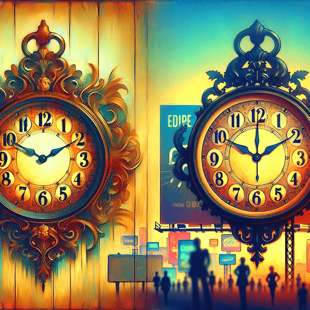
The 10:10 Phenomenon: The Secret Psychology Behind Timepiece Ads
Have you ever noticed that clocks in advertisements are almost always set to 10:10? This isn't a coincidence, but a deliberate practice rooted in marketing psychology and visual aesthetics.


Too Long; Didn't Read
Clocks in ads are intentionally set to 10:10 as a marketing strategy for aesthetic and psychological reasons.
The Timeless Question: Why Do Clocks in Advertisements Often Show 10:10?
Ever flipped through a glossy magazine, scrolled past an online banner, or paused on a TV commercial showcasing a sleek new timepiece? If you paid close attention, you might have noticed a surprisingly consistent detail: the hands of the clock or watch are often set to 10:10. This isn't a mere coincidence or a random choice; it's a deliberate practice deeply rooted in marketing psychology and practical aesthetics. Understanding this subtle detail of why clocks in advertisements often show 10:10 reveals a fascinating intersection of design, consumer perception, and advertising strategy. This blog post delves into the compelling reasons why 10:10 has become the unofficial standard display time for clocks and watches in advertisements worldwide.
The Ubiquitous 10:10: More Than Just Timekeeping
The consistency of the 10:10 setting across countless advertisements, from luxury Swiss brands to everyday digital displays, is striking. While occasionally you might see other times, 10:10 (or sometimes 1:50, which presents a similar visual) dominates the landscape. This widespread adoption isn't accidental; it’s a carefully considered choice by manufacturers and advertisers aiming to present their products in the best possible light, addressing the core of why clocks in advertisements often show 10:10.
Key Reasons for the 10:10 Setting
Several factors contribute to the preference for setting clock hands to 10:10 in promotional materials. These range from psychological triggers to purely practical design considerations.
The "Smiley Face" Effect: A Positive Vibe
One of the most frequently cited reasons is the "smiley face" theory. When the hour hand is at 10 and the minute hand is at 2 (representing 10:10), the hands form an upward V-shape, reminiscent of a smile.
- Positive Association: This "smile" subconsciously evokes positive emotions and a sense of happiness or approval in the viewer.
- Welcoming Appearance: The open, upward gesture is seen as more inviting and aesthetically pleasing than hands pointing downwards (like 8:20, which can look like a frown) or straight across (like 9:15). This subtle psychological cue can make the product appear more attractive and desirable.
Optimal Brand Visibility and Feature Highlighting
Practicality plays a huge role in why clocks in advertisements often show 10:10. The position is ideal for ensuring that key elements of the watch face are clearly visible.
- Logo Placement: Most watch manufacturers place their brand name or logo just below the 12 o'clock position. The 10:10 setting neatly frames this logo, drawing attention to it rather than obscuring it.
- Date Windows and Sub-dials: Other features, such as date windows (often near the 3 o'clock position) or chronograph sub-dials, also remain unobstructed by hands at 10:10.
- Hands Themselves: The hands are clearly separated, allowing their design and craftsmanship to be appreciated. If a second hand is present, it's typically placed around the 30-35 second mark (pointing towards the 6 or 7) to maintain balance and avoid overlap.
Aesthetic Appeal and Symmetry
The 10:10 configuration is generally considered to be the most aesthetically pleasing and balanced.
- Symmetrical V-Shape: The V-shape created by the hands offers a sense of symmetry and visual harmony, making the watch face look well-composed and elegant.
- Dynamic Appearance: Unlike static horizontal or vertical hand positions, 10:10 gives a slight sense of dynamism and readiness. This careful arrangement contributes to the overall visual appeal of the product shot.
Clear Legibility of Hands
Readability is paramount. The 10:10 setting ensures that both the hour and minute hands are distinctly visible and easily distinguishable. This is particularly important for showcasing the design of the hands themselves, which can be a key selling point. Times like 12:00 or 6:30 would cause the hands to overlap, obscuring their individual detail.
Debunking Common Myths
Over the years, several myths have circulated regarding the 10:10 time setting, often linking it to significant historical events. However, these are largely unfounded.
- No Link to Famous Deaths: The time does not commemorate the deaths of figures like Abraham Lincoln, John F. Kennedy, or Martin Luther King Jr. The exact times of their deaths do not align with 10:10, and this practice predates some of these events.
- Not Related to Atomic Bombings: Similarly, claims that it represents the time of the atomic bombings of Hiroshima or Nagasaki are incorrect.
The tradition appears to have evolved organically within the watch industry, driven by the visual and marketing benefits discussed. Some industry insiders and horology historians suggest the practice became more standardized in the mid-20th century as product photography and advertising grew more sophisticated.
Conclusion
So, the next time you spot a clock or watch advertisement, take a moment to check the time. Chances are, it’ll be 10:10, and now you have a comprehensive understanding of why clocks in advertisements often show 10:10. This seemingly minor detail is a calculated decision, blending the psychology of a "smile," the practical need for brand visibility, the desire for aesthetic balance, and the importance of clear legibility. It's a testament to how even the smallest elements in advertising are carefully orchestrated to create a positive impression and showcase a product effectively. While there are no dramatic historical conspiracies behind it, the story of 10:10 offers a fascinating glimpse into the subtle art of marketing and visual merchandising in the world of timepieces.


