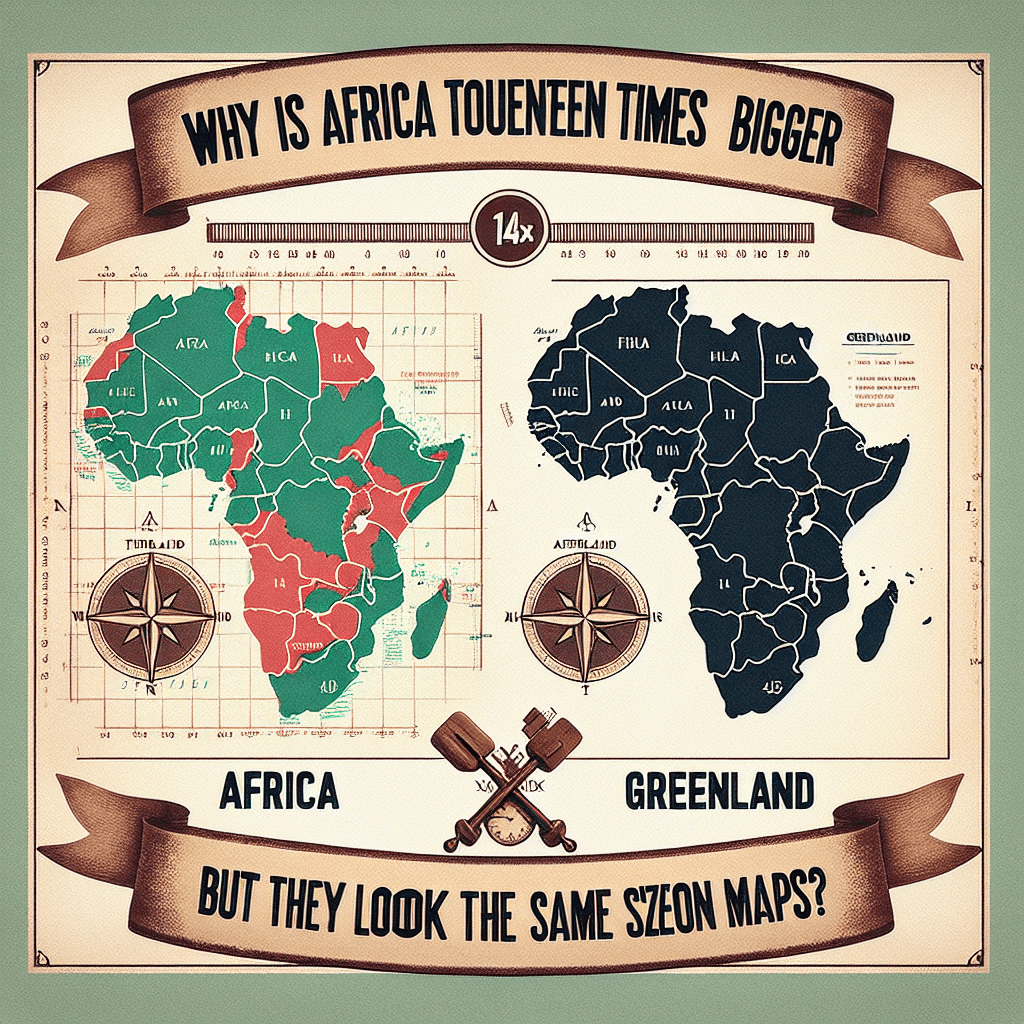
Why is Africa fourteen times bigger than Greenland, but they look the same size on maps
The world map you've always trusted is telling a lie. Discover the shocking cartographic secret that makes Africa, a continent 14 times larger than Greenland, appear deceptively small.

Too Long; Didn't Read
The world is round but maps are flat. The popular Mercator map projection makes this work by stretching landmasses the further they are from the equator. This hugely inflates the size of Greenland near the pole, while Africa, on the equator, is shown closer to its true, massive size.
The Great Map Distortion: Why is Africa fourteen times bigger than Greenland, but they look the same size on maps?
Take a quick glance at a standard world map, the kind you’d find in a classroom or a textbook. Find Africa, then look north to Greenland. They appear to be roughly the same size, right? Now for the shock: in reality, Africa is more than fourteen times larger than Greenland. You could fit the entire United States, China, India, Japan, and most of Europe within Africa’s borders. This staggering visual discrepancy isn't a mistake; it's a feature of the map that has shaped our perception of the world for centuries. This post will unravel the cartographic secret behind this illusion, exploring why the map on your wall tells a fascinating, but distorted, story about our planet.
The Challenge of Flattening the Earth
The fundamental problem cartographers have faced for millennia is simple yet profound: how do you represent a three-dimensional sphere (the Earth) on a two-dimensional flat surface (a map)? The answer is that you can't do it perfectly.
Imagine trying to flatten an orange peel. No matter how carefully you do it, the peel will either stretch, tear, or break apart. The surface of a sphere cannot be flattened without distorting it in some way. Every world map you've ever seen is a projection—a specific method of "unpeeling" the globe—and each one involves a compromise. Cartographers must choose what to distort:
- Size (Area)
- Shape
- Distance
- Direction
The map most of us are familiar with chose to sacrifice size for the sake of direction.
The Mercator Projection: A Navigator's Best Friend
The map responsible for this massive size distortion is the Mercator projection, created by geographer Gerardus Mercator in 1569. Its original purpose was not to be a perfectly accurate representation of landmass size for schoolchildren; it was a revolutionary tool for nautical navigation.
The genius of the Mercator projection is that it preserves angles. Any straight line drawn on a Mercator map is a line of constant compass bearing. This allowed sailors to plot a course from one point to another as a simple straight line, making it an invaluable tool for crossing vast, open oceans for centuries.
To achieve this navigational convenience, Mercator had to make a significant trade-off. To keep the lines of longitude parallel instead of converging at the poles as they do on a globe, the map dramatically stretches landmasses the further they are from the equator. Greenland, being very close to the North Pole, is stretched to an enormous extent. Africa, which straddles the equator, is depicted with far less distortion and is much closer to its true relative size.
The Visual Deception: Africa vs. Greenland
Let's look at the numbers to see just how extreme this distortion is:
- Africa's True Area: Approximately 30.37 million square kilometers.
- Greenland's True Area: Approximately 2.16 million square kilometers.
Mathematically, Africa is over 14 times the size of Greenland. However, on the Mercator projection, Greenland is stretched to appear as large, or even larger, than a continent that could contain it many times over. This distortion also affects other areas. For example, Alaska appears larger than Mexico, when in reality Mexico is larger. Scandinavia looks like it could swallow half of Europe, but it's a fraction of the size of India.
Beyond Mercator: More Accurate Projections
For decades, cartographers have argued that the Mercator projection gives a misleading impression of the world's geopolitics, often subconsciously diminishing the size and importance of equatorial nations in Africa, South America, and Southeast Asia.
In response, other projections have been developed to offer a more balanced view.
- The Gall-Peters Projection: This map prioritizes showing the accurate size of countries (it's an "equal-area" projection). While it succeeds in this, it noticeably distorts their shapes, making them look long and stretched.
- The Winkel Tripel Projection: A compromise map that tries to minimize distortion in size, shape, and distance. Since 1998, it has been the preferred projection for the National Geographic Society. It shows a more visually balanced and accurate world, with Greenland shrinking back to its true proportional size.
A New Perspective on Our World
So, why does the Mercator projection persist? Largely due to tradition and its adoption by early web mapping services like Google Maps, which valued its grid-like structure. While many platforms now use more nuanced projections, the Mercator’s image is ingrained in our collective consciousness.
The story of Africa and Greenland on the map is a powerful reminder that every map is a tool with a specific purpose, and each one tells a different version of the truth. Understanding the Mercator projection's flaws helps us develop a more accurate mental image of our planet and appreciate the true scale of its continents. The next time you look at a map, ask yourself not just what it shows, but what story its particular distortions are telling.